Darren Palmer has a broad portfolio, having studied fine art & graphic design, originally working in advertising and owning his own graphic design company. After succumbing to his true passion, Darren now operates his own interior design studio and has been a judge on numerous seasons of The Block.
What’s not to love about Gelato?
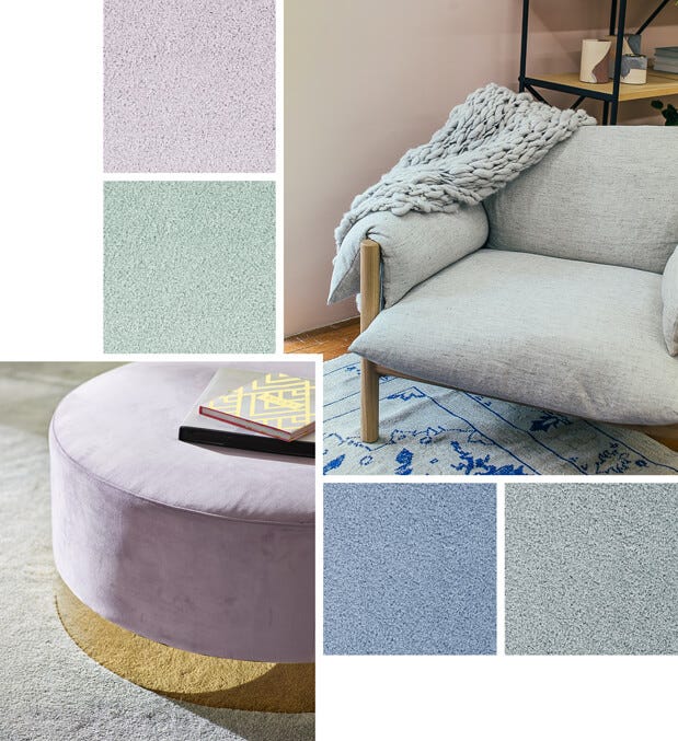
What’s not to love about Gelato? It’s creamy, colourful and comfort filled. Just as it does in our multicultural food landscape, the gelato approach fits into your home in more ways than one. The tenants of gelato crossover from food to interiors with surprising ease. Curves, pastel colours, comforting textures and a sense of fun are the common elements that tie the look across these seemingly very different experiences.
When coveting the gelato look in your home, look for curvy sofas or a curvy bench, puffy, rounded and ‘bubble’ shaped furniture. There’s a glut of options in curvaceous furniture right now and they’re often covered in Boucle - a textured fabric that is seeing a resurgence in contemporary homes.

Pastel colours have also been given a revival, this time in colour intensity. Though still light in tone, they now have a more intense hue enabling you to get interest in colour while still being able to accent within a light and neutral based palette.
If you’re wondering exactly what ‘gelato colours’ are, then check out your local gelateria for inspiration - pistachio greens, soft strawberries, lemon sorbet, gentle blues, mauves and lavenders all meet the criteria.
When incorporating these colours into your home, playing with carpet is a fun way to explore this trend. As a starting point, try a pink or blue carpet in just one bedroom, or take a leap and carpet one of your living spaces to inject some vibrancy. If you prefer hard flooring but would like to add some gelato-inspired fun in your home, look for a yellow, blue, or pink fluffy or shaggy rug.
The key to understanding how to mix gelato based colours in your home is to think of the elements that make up the colour. The first element is the hue, which is the actual colour in reference to the colour wheel. The other is the saturation, or the amount of vibrancy and intensity that the colour has. The third element is the tone, which is the level of white or black that the colour has in its make up.
Most colours can be placed with each other if they share a similar tone and saturation level. Gelato colours all have a nice saturation of colour but are slightly grey based. When choosing colour combinations, take your colour swatch book to the gelateria (and get a scoop of gelato too!) to see what works.
You can have too much colour in a space, so it’s often good to pair your window treatments with something a little more neutral. Carpet Court’s Veri Shades® fit the ‘soft serve’ look perfectly in almost every home – they’re beautifully soft and compliment gelato colours with their neutral palettes and curvaceous flow.


NEED MORE INSPIRATION?
View more of our Seasonal Trends articles or check out Influencer Collaborations for more interior ideas and design tips.