Gradating Colour

Ombre has been a huge trend over the past few years, with fabrics, rugs and even hair getting the two-tone, blended treatment. Having graduated from what was a tonal approach to now more of a graphic one, the ombre trend is embracing colour combination and blending more than ever. This coloured ombre style creates a bold and interesting statement within any space, through the use of artwork, occasional tables, cabinets, décor and more.
The effect of gradating colour sets the style apart from other single or dual-toned interior finishes, always making for a statement in any space. As there are often several colours involved when gradating, it is the perfect solution for creating bold and striking Spring looks in 2018.
High-end interiors will see the use of gradated colour adding a new dimension to contemporary and minimal interiors. A simple monochromatic scheme would be a suitable backdrop for bringing a gradated colour piece to the forefront of any space. Whilst a gritty, urban or industrial space could equally be brought to life with the right application of gradated colour.
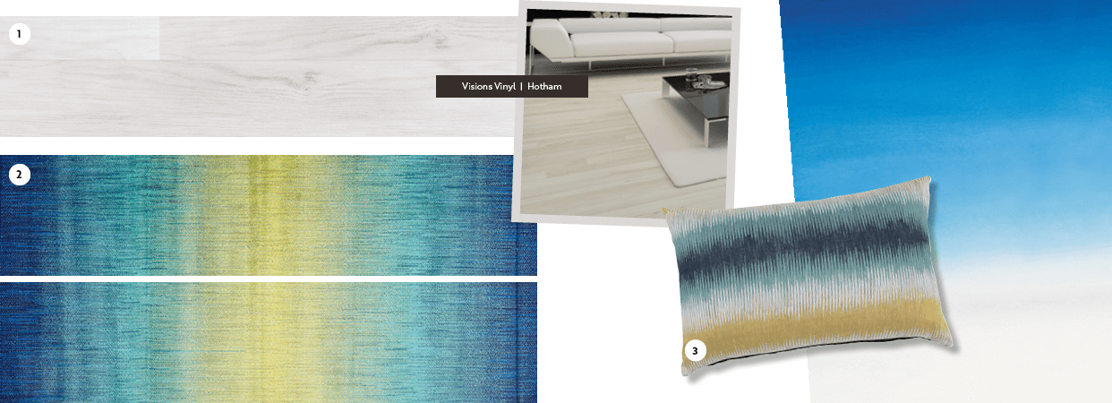
Create a suitable backdrop in your home with Carpet Court Visions Vinyl in colour Hotham, or add texture and tonal variation with Vinyl Sheet in Laurel Oak 593. With the right application of gradated colour, these Vinyl products are the the perfect interior inclusion to explore this Spring. As a refined and art-focused approach to colour application.
Carpet Court’s Concepts Rug in Colour Dreamscape Blue could be a good pair for gradated, colour-infused interiors.

Get the Carpet Court Look
1. Visions Vinyl in Hotham
2. Concepts Rugs in Dreamscape Blue
3. Halimeda Cushion by Darren Palmer (Myer)
