Heather Nette King is a Melbourne-based interiors stylist and writer for many leading interior titles and newspapers. The hallmarks of her styling are colour and vibrancy, and she writes passionately about peoples’ homes and how they live in them.
Bold and beautiful prints are a sure-fire way to get your room noticed. In interiors they are known as a ‘WOW’ moment - a showstopper that will stamp your individual style on your home. Most people assume that it takes confidence to use bold prints, but the truth is, you can get your showstopper moment without having to devote a whole wall or sofa to the cause; sometimes less is best, and you can create a bold moment with just a few small tricks.
FIRSTLY – WHY GO BOLD?
I’ve always advocated for decorating with your heart, rather than following trends just because everyone else is. So, if the thought of bold prints makes you green at the gills, then perhaps this isn’t the look for you. However, if it sets your heart racing, then let’s learn the dos and don’ts to achieve the best of bold rooms.

WHERE DO I PUT MY PRINTS –
ALL OVER OR JUST A BIT HERE AND THERE?
A lot depends on your commitment level, but if you use lots of prints in your soft furnishings such as cushions, furniture upholstery or window coverings, then it is best to have plain walls and simple floor coverings. It’s the same in reverse too – if you cover your walls in a bold wallpaper or painted finish, then you will need to be very selective about any extra prints that you add to your soft furnishings.
WHAT ABOUT SCALE?
Whether they’re large or small in scale, it’s important to remember that prints can be very bold. A floral pattern can be dainty or bold, depending on the colour palette and the amount you use. For example, a small floral will look dainty on a cushion, but if four walls are covered in it, then its strength will be amplified.
WHAT ABOUT MIXING AND MATCHING PRINTS?
This is where rooms featuring bold patterns can either become winners, or ‘ba-bowww’. Mixing spots, stripes, florals, checks, plaids, and tribal motifs can look incredible, but there needs to be a common thread. This can be either the colour palette or the scale of the print or theme, such as botanicals. Without something to pull it together, the room may end up looking a little lost.
HOW DO I USE BOLD PRINTS ON MY FLOOR?
A boldly patterned floor can provide an amazing anchor for a room. It can dictate a colour palette or consolidate the style, providing a focal point for the room plan.
Floral carpet or floral rugs, such as Carpet Court’s Museum range, can be very pretty or romantic if they’re traditional in style or even very moody if the colour palette features dark burgundy, deep rose and black. Patterned rugs, such as Carpet Court’s Evoke in Remy Silver, can signal a decorating style – a strong geometric print can reflect a Hollywood regency style room.
Checkerboard rugs are enjoying a big revival now and work well with the Memphis-revival style. Patterned rugs and patterned carpet bring a sense of liveliness to a room, drawing your eye into the centre, so they’re great for communal areas. And finally, a textured carpet can make a bold statement, even if it’s in a single hue, just by virtue of its visual texture – a shaggy, deeply-piled carpet will always get attention.
SO, WHAT PATTERNED RUGS WILL BE POPULAR THIS SPRING?
The good news is that bold is back – so look for patterns like checkerboards, chevrons, strong florals, and stripes that will add that touch of boldness to your beautiful homes.


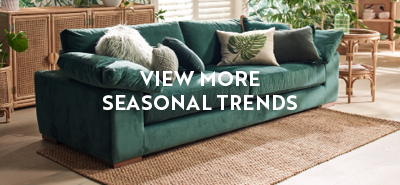
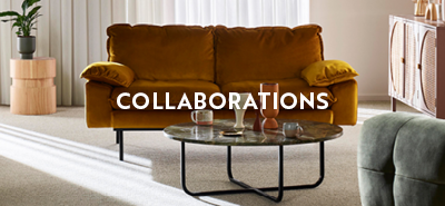
NEED MORE INSPIRATION?
View more of our Seasonal Trends articles or check out Influencer Collaborations for more interior ideas and design tips.