Neutrals: Warm Vs Cool

CREATING AN AMBIANCE
Firstly let’s start with what is considered warm and what is considered cool when it comes to colour tones. Warms are the colours on the red, orange, yellow side of the colour wheel with all of their tones, hues and permutations. Cool colours are purples, blues and greens. In between you have Magentas and the tonal variants of pink, which can skew warm generally, but could also align to cooler palettes depending on the amount of blue in their hue.
When it comes to their impact on a space, warm colours envelop you. They feel cosy, comfortable and, well.. warm! Cool colours refresh. They feel bright, airy and cool.
A room with a neutral palette can be given visual warmth or cool through the balance of either set of colours, with differing levels of the visual and physical perception of temperature being able to be nuanced by splitting the use of both warm and cool hues in the same space. Think of it like turning a colour thermostat.
WARM VS COOL TONES IN DIFFERENT AREAS OF THE HOME
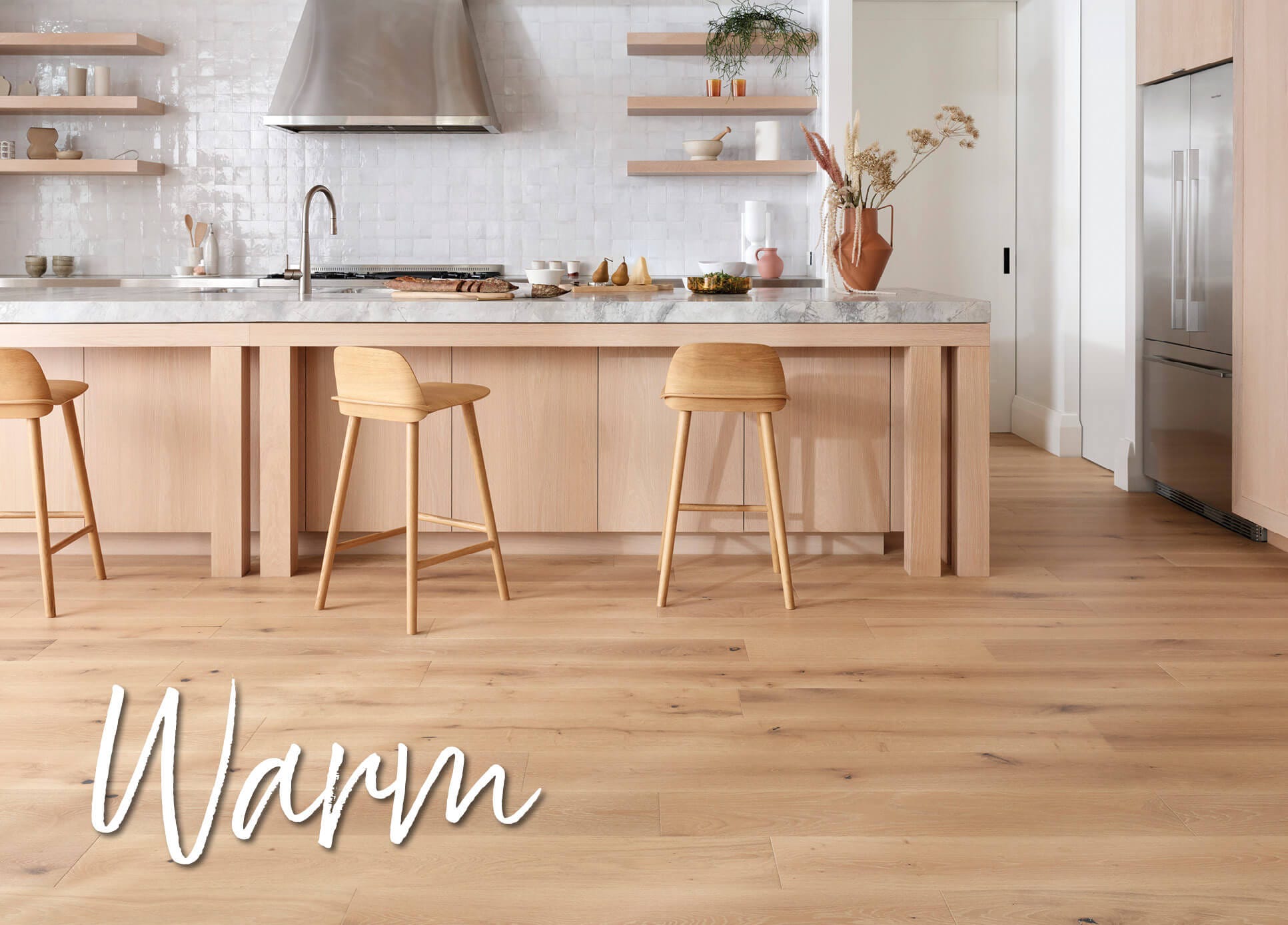
Different areas of the home will call for different levels of warmth, for example a living space should ideally have access to more light and more air. You can freshen the space even further by the use of greens and cool blues, often complimenting well with available vistas of plant life and skies.
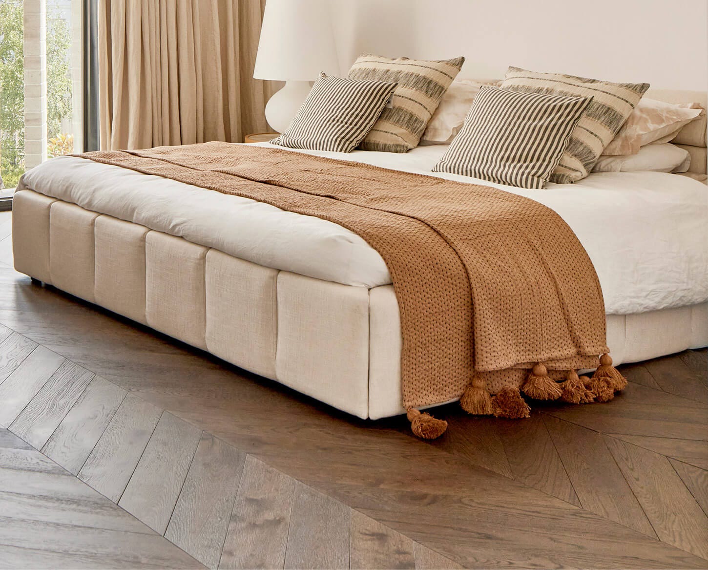
A bedroom will more likely be a contained space, having a lessened exposure to the outdoors. We often want these spaces to feel cosy, hence a warmer palette is often the obvious choice. This isn’t a hard and fast rule though, as some bedrooms benefit from being visually cooled especially if they have direct exposure to high heat or afternoon, western sun. In these instances a cooler palette can go some way to helping the room feel like a more fresh and cool space.
Bathrooms can skew warm or cool, depending more on the overall palette defined throughout the home, with warm neutrals and warm brown based greys being more on trend currently. As with all trends this pendulum swings back and forth every few years so as a rule of thumb work with your home’s geography, it’s actual physical temperature, and the overall feeling of warmth or cool you’ve embraced in the rest of your home. The same is true for kitchens, in that they can benefit from being cool or warm, though I recommend considering the importance of marrying the aesthetic of your living and dining spaces to that of your kitchen.
ALTERING THE VISUAL SIZE OF A SPACE USING WARM OR COOL TONES
There are many ways to define or separate the types of colour and their impact on spaces, one of the most useful in terms of visual size is the principle of dominant or recessive colours.
Dominant Colours are bold, saturated, and attention-grabbing (e.g. red, yellow, black). These create focal points and evoke energy or drama. Defined by their intensity and visual impact.
Recessive Colours are soft, muted, and background-blending (e.g. pastels, whites, greys). These create balance and calm. Defined by subtlety and lower saturation.
If you understand the principle of dominant and recessive colour you can change the proportions of your rooms. By painting a centre wall in a dominant colour the room jumps closer to you, making it look shallower and more wide. By painting a dominant colour on the side walls, these walls jump inward to the room, making the centre wall fade backward, making the room appear narrower but deeper. Make sure you understand the effect of dominant and recessive colour when selecting not only the hue, but the saturation and tone.


NATURAL LIGHT VS ARTIFICIAL LIGHT
As a general rule of thumb, interiors look best with warm light. Light temperature is measured in a unit called Kelvins and the lower the number in 1000s the warmer the temperature of light. For ambience, around 2700 kelvins is comfortable. For neutral white, 3200K is a guide. Working and task light, around 4100K give something like white light. If you want to emulate the cool light reflected from water or from the sky, then you’ll look for around 6500K.
CURTAINS, BLINDS, AND THEIR IMPACT ON LIGHT
The colour of light that comes in from outside is the first important consideration. A red brick building will reflect warmth, a blue ocean will reflect cool, these temperatures of light will then project onto the colours within your spaces affecting things like paint and flooring colours. Also, what that light filters through will change the colour of light coming into your spaces. If you have cool light filtering through warm brown sheers then you’ll end up with a neutral glow to your room. Red brick reflecting red light through warm yellow based sheers will only intensify the warmth of the light streaming into your spaces.
When you’re selecting a product like Carpet Court's Bali Sheers think about the above, select the colour that will feel right for your aesthetic but also filter the right temperature of light into your space.
You can also control the amount of light with Carpet Court’s Veri Shades, allowing you to manage how much of the colour from outside comes in, along with the amount of brightness or darkness you hope to have in your space at any given time.
CURRENT INTERIOR DESIGN TRENDS
Right now, we're seeing trends like Colour Drenching, which leans heavily into deeper tones of both warm and cool hues. This style is all about immersing a room in a single colour from floor to ceiling, using shades like warm browns, rusty terracotta or dark navy and forest green. It's a bold, confident design move that creates an intimate, cocoon-like environment. Match your colour drenching with carpets from the Scenic Eclipse range from Carpet Court, or add a sophisticated base with Carpet Court’s Amaroo Chevron
or Herringbone.
On the other hand, Dopamine Decor leans toward bright, cheerful tones designed to uplift the mood. It taps into vibrant shades of primary colours in both warm and cool hues. Dopamine Décor is about fun and playfulness, and the Passionate Range of carpets from Carpet Court deliver that in spades with colours like Celeste, Serene Blue and Magnolia.
For a ‘mad men’ kind of cool, Mid-Century Modern brings mid toned colours into focus. This style often uses sleek lines, natural materials, and colours like green, brown, mustard yellow, orange, teal and pink making the space feel timeless and tranquil. Carpet Court’s Hideaway range has colours like Oasis that can add some mid-century quirky appeal.
Ultimately, it comes down to your personal aesthetic and the kind of feeling you want to evoke in each room. Whether warm or cool, the beauty is in the balance, and Carpet Court has the products to help you achieve your perfect palette.